Bedroom shelves don’t have to be just storage, they’re prime real estate for creating visual interest and personality in one of your home’s most intimate spaces. Whether you’re working with floating shelves, built-ins, or corner units, the way you style them can set the entire tone of the room. This guide walks you through practical decor strategies that work whether you’re a minimalist or a collector, and shows you how to arrange what you own so it actually looks intentional rather than cluttered.
Table of Contents
ToggleKey Takeaways
- Mix textures and materials like wood, ceramic, glass, and metal on bedroom shelf decor ideas to create depth and prevent a flat, sterile appearance.
- Limit your color palette to 3–4 dominant hues with one neutral anchor and repeat accent colors across multiple items to create an intentional, cohesive look.
- Display meaningful personal collections and items in odd-numbered groupings (3 or 5) that tell your story rather than hiding collections away.
- Incorporate greenery and natural elements like trailing pothos, succulents, dried botanicals, or woven baskets to soften shelves and add organic warmth.
- Use warm white LED lighting (2700K) positioned to gently illuminate shelves, transforming them into a focal point that works both day and night without glare.
- Balance visual weight through varied heights and asymmetrical arrangements, alternating between vertical stacking and horizontal layering for a modern, livable aesthetic.
Mix Textures and Materials for Visual Interest
Stacking the same type of object, books on books, or candles next to candles, flattens a shelf visually. Instead, pair different textures to create depth and keep the eye moving. Think wood boxes beside ceramic vessels, a woven basket against a metal frame, or linen-bound books leaning next to a smooth glass vase.
This mix prevents your shelf from looking sterile or overly curated. In practice, you’re layering tactile contrasts: rough woven materials against smooth glass, matte ceramics against polished metals. Leave some breathing room so each item has space to shine, crowded shelves feel chaotic no matter how nice the items are.
When selecting pieces, consider how light hits different surfaces. A matte white ceramic catches light differently than a glossy one, and metal accents reflect and add small sparkles. A natural wood shelf with a metal bookend and a stone object creates a rich, layered look without feeling overdone.
Create a Cohesive Color Palette
Limiting your shelf color palette to 3–4 dominant hues keeps things harmonious rather than chaotic. Choose one neutral anchor (white, cream, gray, or natural wood), add one or two accent colors, and let everything else support that scheme.
For example: a warm white base with terracotta and sage accents creates a grounded, inviting look. Or go with soft gray shelving, soft blue decor pieces, and warm brass hardware for a contemporary feel. The key is repeating colors across multiple items, if you have one blue book, your eye doesn’t register it as intentional: if you have three items in that same blue (a journal, a vase, a framed piece), it reads as a deliberate choice.
Don’t forget that your actual shelf material is part of the palette. A white floating shelf recedes visually and lets your decor pop, while a natural wood shelf with dark stain makes bold statements, color-wise and materially. Test your arrangement before committing: photos under the same lighting conditions you’ll view them in daily show whether colors truly work together.
Display Personal Collections and Meaningful Items
Collections, whether vintage cameras, art books, small sculptures, or travel souvenirs, should be the hero of your shelves, not hidden away. Group similar items loosely so they feel intentional. Three small framed photos or five vintage paperbacks work better grouped than scattered across the shelf.
Meaningful items like a award, a handmade vessel from a friend, or a keepsake from a trip anchor your display emotionally. These are conversation starters and mood-setters. They remind you why you love your space. The trick is balancing display with restraint, showing your favorite 20% of a collection, not all 100%.
Interior design sources like MyDomaine emphasize that personal touches transform generic spaces into homes. If you’ve collected postcards, display a rotating selection in simple frames. If you love art books, lean a few with their spines showing and lay others flat with an object on top. This approach celebrates what matters to you without looking like a showroom.
Incorporate Greenery and Natural Elements
A shelf with no greenery or natural materials can feel sterile. Adding a pothos vine trailing from one corner, a small succulent in a clay pot, or a bundle of dried pampas grass softens the look and brings organic shapes into the display.
Live plants require attention, they need the right light, water schedule, and humidity. A low-maintenance option is a pothos or snake plant trailing from a wooden shelf into the space below. If live plants aren’t realistic for your bedroom lighting, dried elements work just as well: eucalyptus stems in a vase, dried grasses, or pressed botanicals in a simple frame. Wood, stone, and woven baskets also count as natural elements and add warmth without demanding care.
One practical note: if you’re using live plants on shelves, ensure your shelf is level and sturdy enough to handle the water weight. A ceramic pot with soil and a plant can weigh 3–5 pounds. Check your shelf’s load rating if you’re using floating shelves, most rated floating shelves handle 25–50 pounds per shelf when properly installed, so plants are fine, but cluster them toward the center for even weight distribution.
Use Lighting to Enhance Your Display
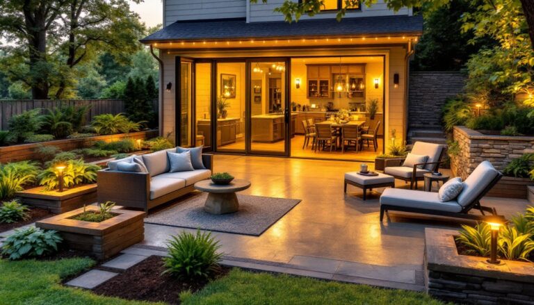
Lighting transforms a shelf from daytime-only appeal to a focal point that works at night, too. Small LED strip lights mounted above or below a shelf create ambient glow and make your decor feel intentional and gallery-like.
Options include battery-operated puck lights (cheap, easy, no wiring), adhesive LED strips (flexible and hidden behind a small lip), or hardwired under-shelf lights (most polished if you’re willing to run power). Warm white light (2700K color temperature) feels cozy in a bedroom, while cool white (4000K+) reads more modern and makes details pop.
You don’t need bright lighting, a soft glow is all you need. Aim the light slightly downward so it illuminates the items without creating glare in your eyes when you’re in bed. If you’re renting or want no wiring, battery puck lights under each shelf section work fine and cost $20–40 per set. Avoid harsh overhead lights shining directly onto shelves: they wash out colors and create harsh shadows.
Style Your Shelves With Balance and Symmetry
Balance doesn’t mean identical items on either side, it means visual weight distribution. A tall item on one side should be balanced by a clustered group or slightly heavier element on the other. Symmetry (matching objects on both sides) works for formal, traditional spaces, but asymmetrical balance feels more modern and forgiving.
A practical approach: vary heights across your shelf. Taller items pull the eye up, shorter items toward the center. Alternate between vertical stacking (books standing upright) and horizontal layering (books laid flat with something on top). This variation prevents a flat, monotonous look.
Grouping odd numbers, 3 or 5 items in a small vignette, feels more natural than pairs or even numbers. So three books in one color, five small objects clustered, or a tall piece with two shorter companions around it. This rule isn’t absolute (life isn’t perfectly odd), but it’s a starting point. Professional stylists at House Beautiful and design platforms regularly use odd groupings to achieve polished shelves that still feel livable.
Conclusion
Great bedroom shelves happen when you mix intention with your actual lifestyle. Use these strategies as a starting point, but trust your eye, if it looks good to you and makes you happy, it’s working. The best shelf decor tells your story: your tastes, your travels, your collections. Step back, assess the overall look, and adjust one element at a time. Simplicity with personality always wins over perfection.